Simplifying billing
Making Terraform Cloud's upgrade and downgrade experience easy and understandable
An unusual billing model
Different from simple fixed-price tiers, Terraform Cloud's model incorporated a sliding scale of concurrent runs and variable cost add-ons.
Price = ( $Run + $Add-on_A + $Add-on_B ) • Concurrent Runs
Concurrent Runs was the basis of the model. When you upgraded to a paid tier, you unlocked the ability to parallelize your operations. Each additional Concurrent Run you added was charged at a certain fixed price.
Add-ons allowed you to turn on additional functionality à la carte. Each add-on was priced as a multiple of Concurrent Runs.
These two were deeply entwined and my challenge was to convey this clearly while also preventing users from making incorrect decisions.
Note: We later evolved the pricing model away from concurrent runs and add-ons. Nevertheless, the designed solution still serves as a good example of accommodating this complexity.
Starting with low-fidelity
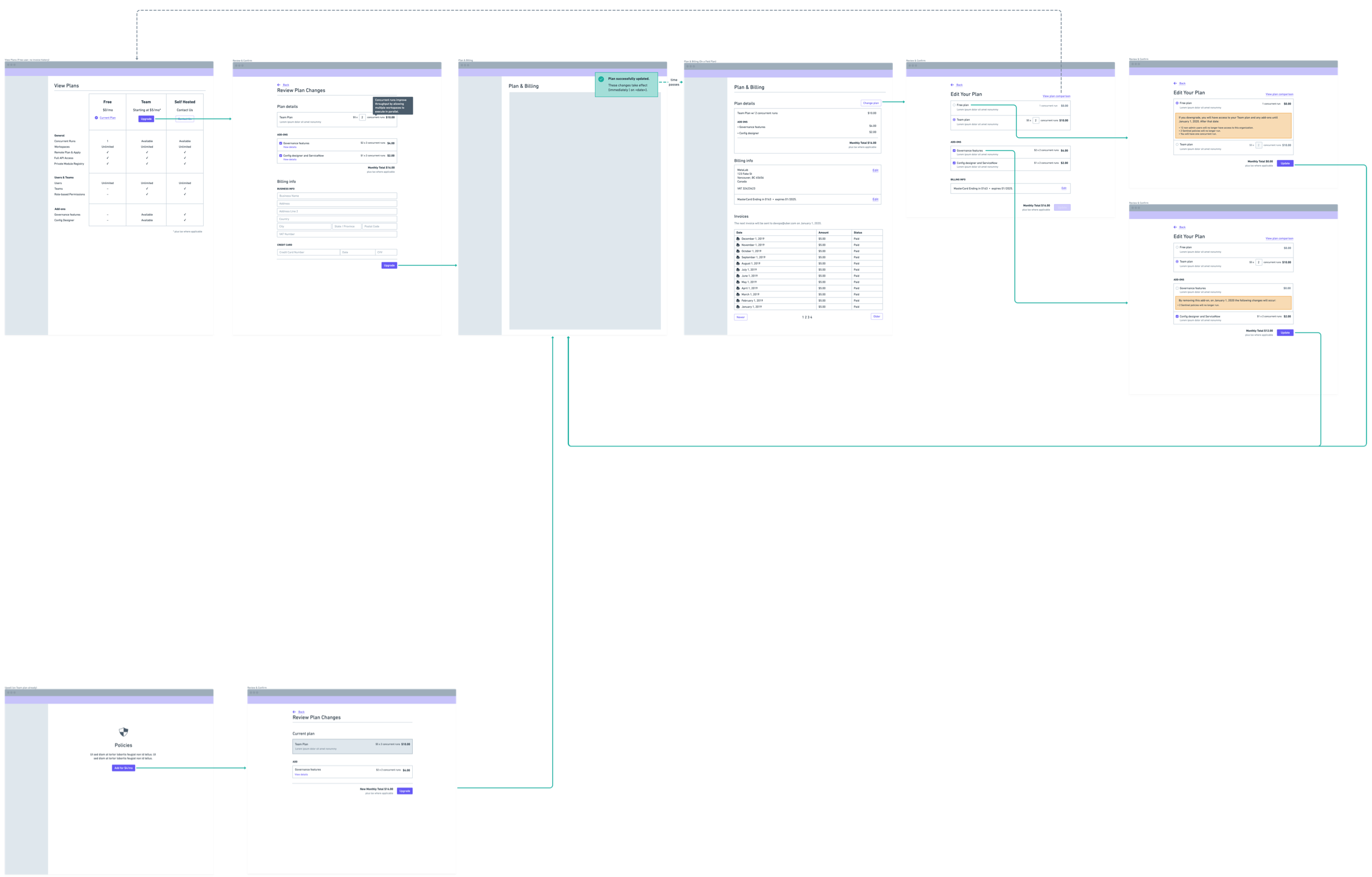
Alongside our engineering and product teams, I began diagramming out the expected flow. Starting with boxes and arrows, I eventually transitioned to wireframes as we gained clarity and refined our ideas.
Moving to high-fidelity
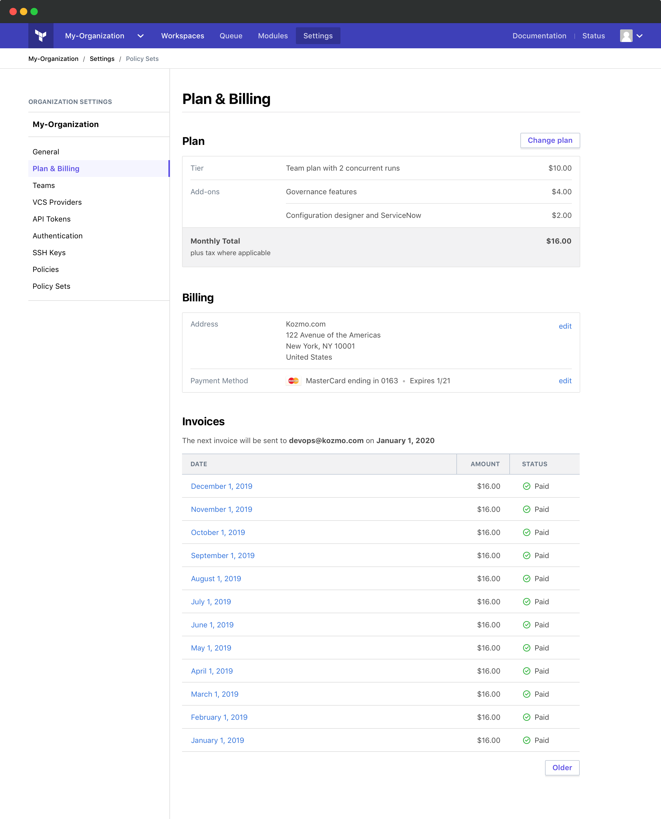
Starting with the Plan & Billing page allowed me to establish design patterns that could be utilized on other pages.
Editing
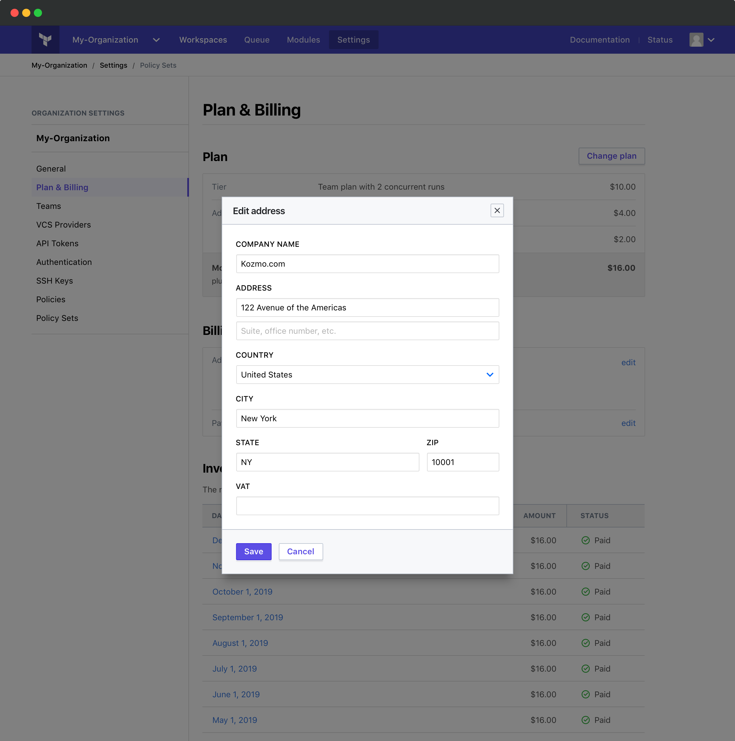
Certain bits of information, such as payment method, need to be editable in a few places within the app. A modal lets us reuse this functionality, which helped simplify the build while not inconveniencing the user.
Upgrading
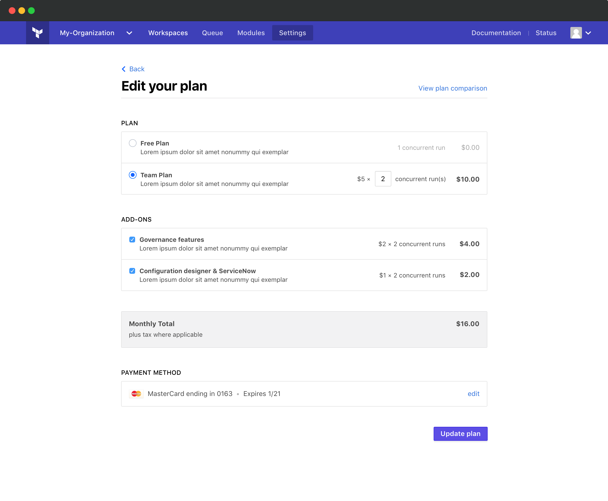
When the user goes to change their plan, they can select from a Free or Team tier. If upgrading to Team, they can update the number of concurrent runs inline.
This dynamically updates the prices for other items on the page. Microcopy helps us "show the math" in a straightforward way.
Downgrading
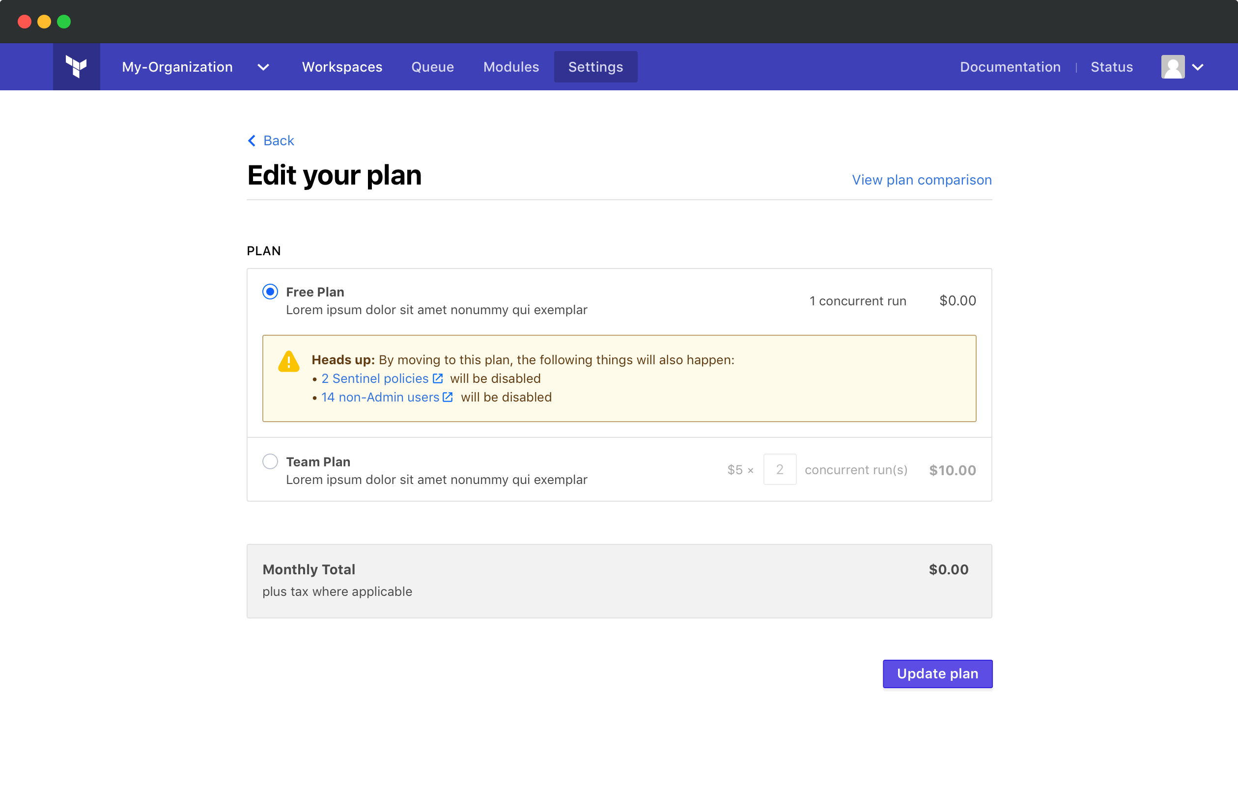
We want to freely allow users to downgrade with minimum friction. However, this act can have serious ramifications if they are using certain features.
When we detect they are using these features, we introduce inline messaging to help them understand what they will lose.
This added friction gives them a moment to think through the impact of this decision.
Importantly, we link to these affected features in a new window. This small choice helps us convey that we're acting on their behalf and not trying to make downgrade hard.
