Managing users
Redesigning user invitation and management system in Terraform Cloud.
As we evolved our billing model to one based on number of users, the prior user management system wouldn't work. Because of Terraform Cloud's origin as enterprise on-premises software, features common to SaaS offerings didn't exist.
This suite of features supported the ability for customers to invite users, assign them to teams, and manage them as they moved between paid and free plans.
Initial collaboration and exploration
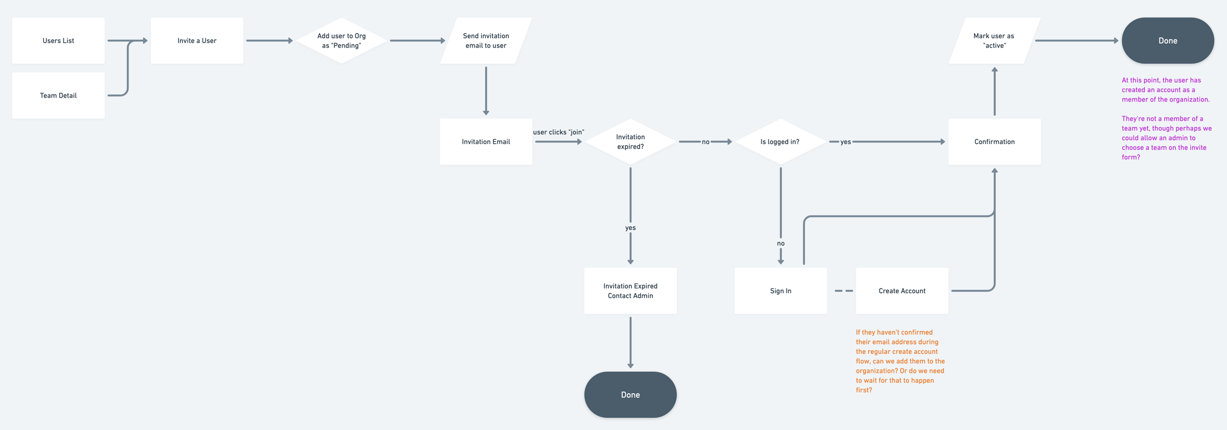
Because there were quite a number of legacy considerations to handle, I started out quite rough. In Whimsical, I began sketching out user flows and iterating on these with engineers on the team.
As we gained a shared understanding of the problem space, we moved into wireframes. We revisited these occasionally as edge cases cropped up that needed additional thinking.
I shared this proposal with the broader HashiCorp organziation via our Request for Comment (RFC) process to ensure we were all in alignment about the proposed changes.
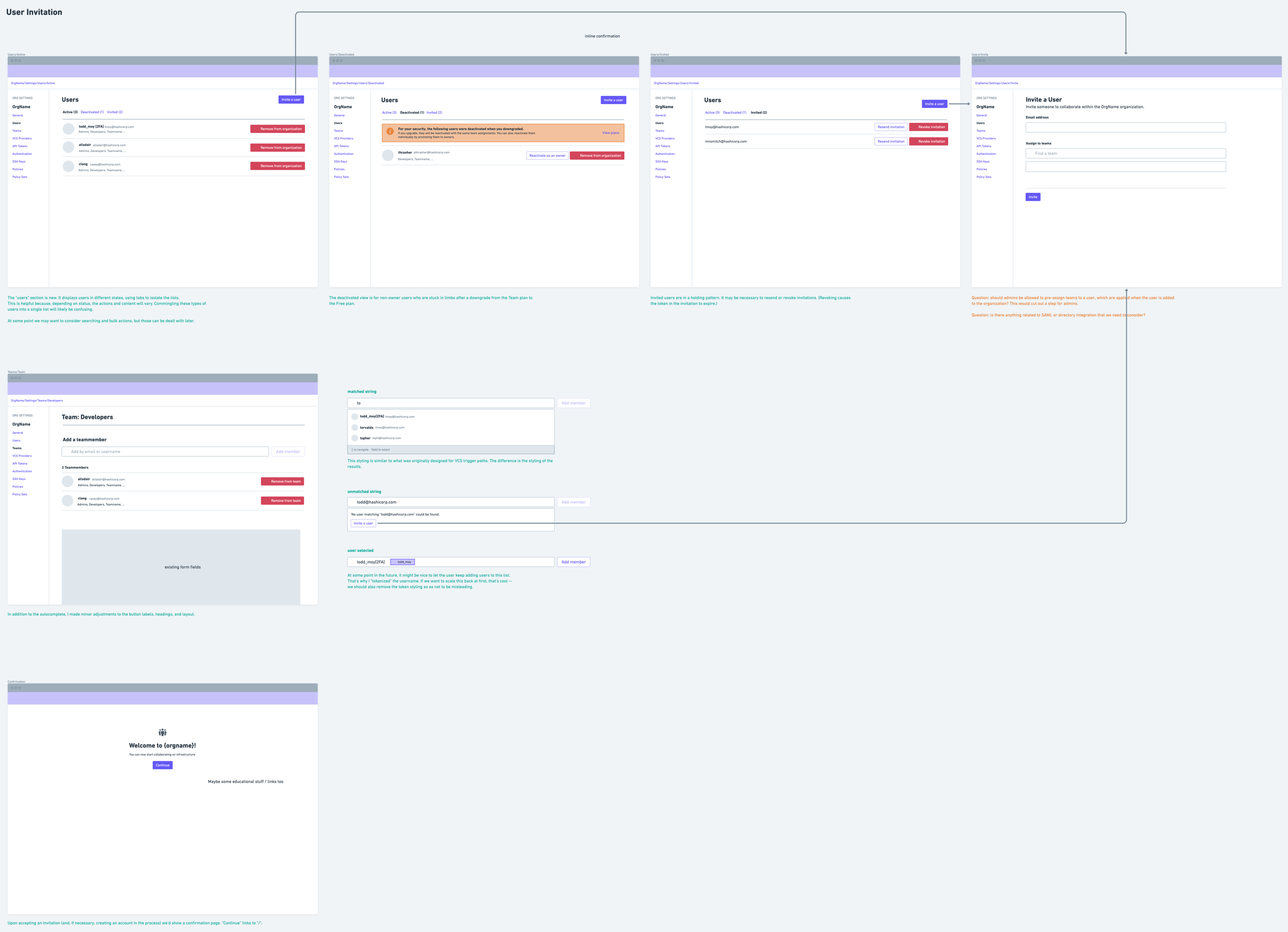
After this, we moved into final design. The wireframes and flows were at a high enough fidelity that engineering work could begin in parallel while I did final polish, which required collaborating with other designers to contribute new patterns to our design system.
The following screens show a glimpse of the work.
Handling users in different states
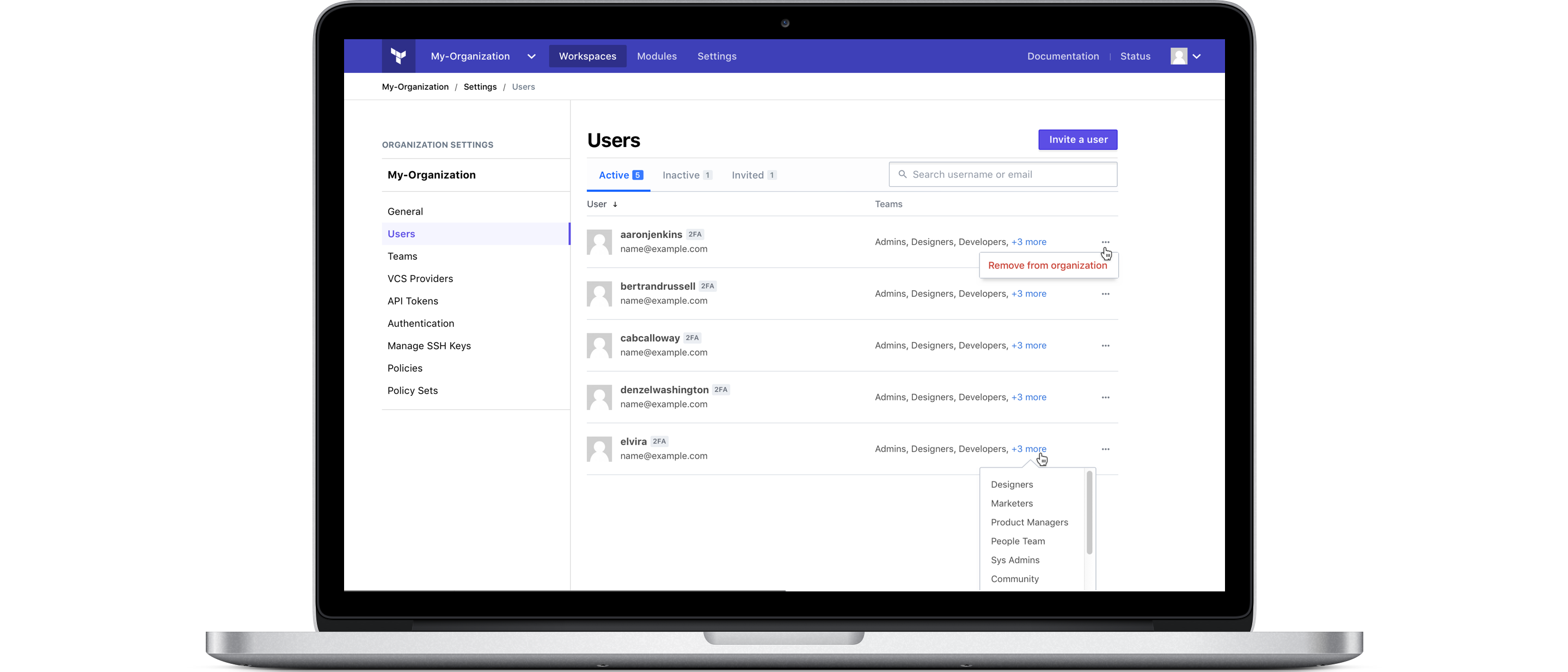
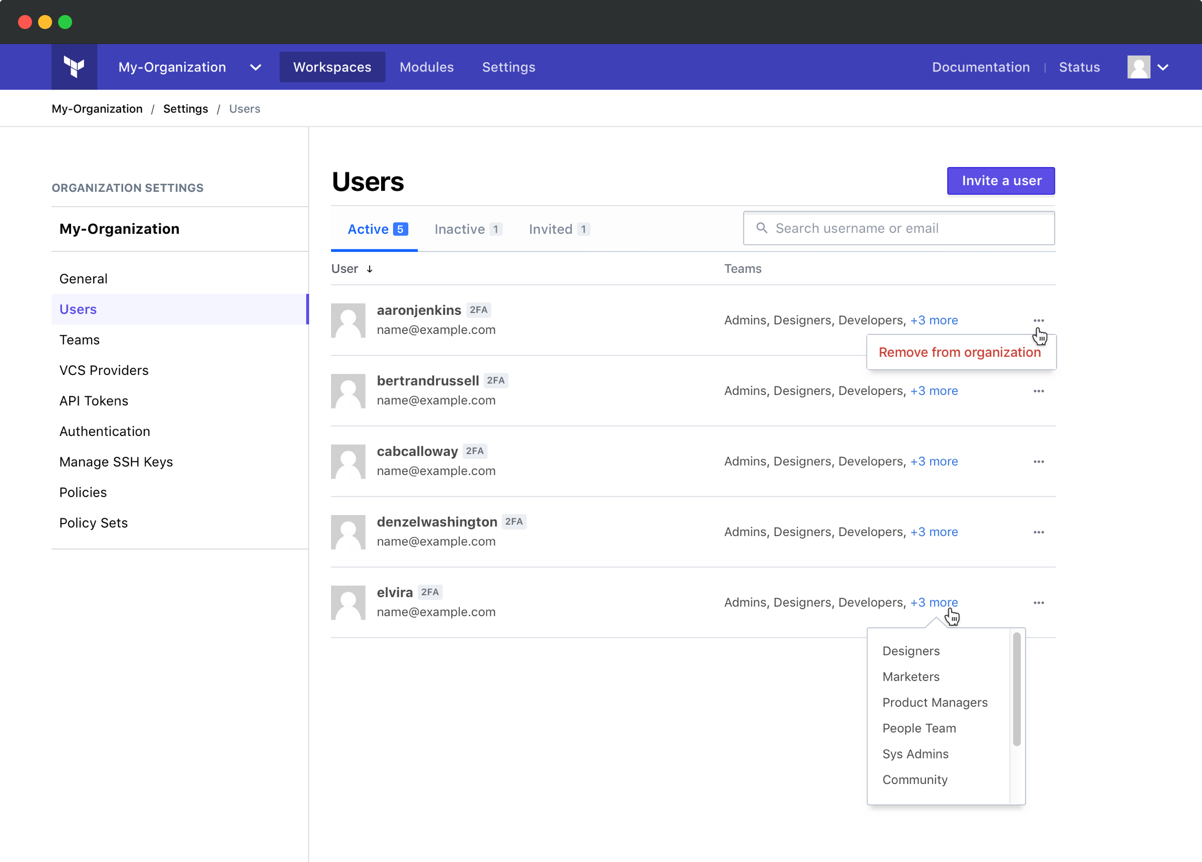
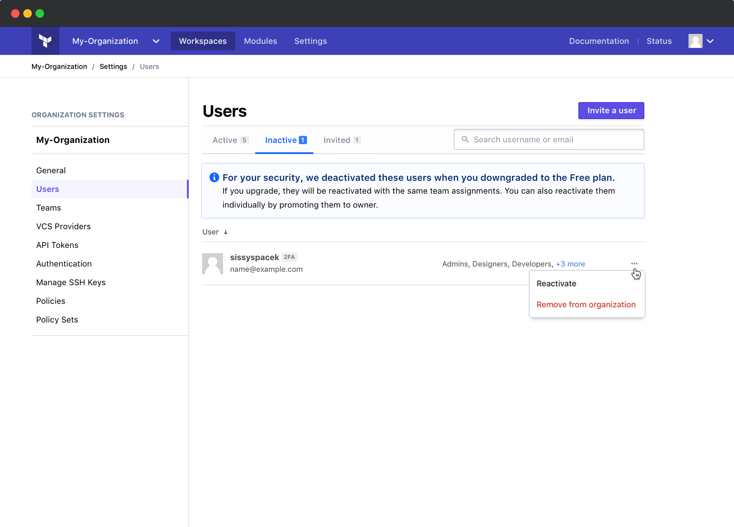
Users can be one of three states: active, inactive, or invited. The metadata and actions differ depending upon this status. Commingling these types into one list could lead to a confusing UX.
To prevent confusion, users are separated into tabs based upon their status.
Facilitating search
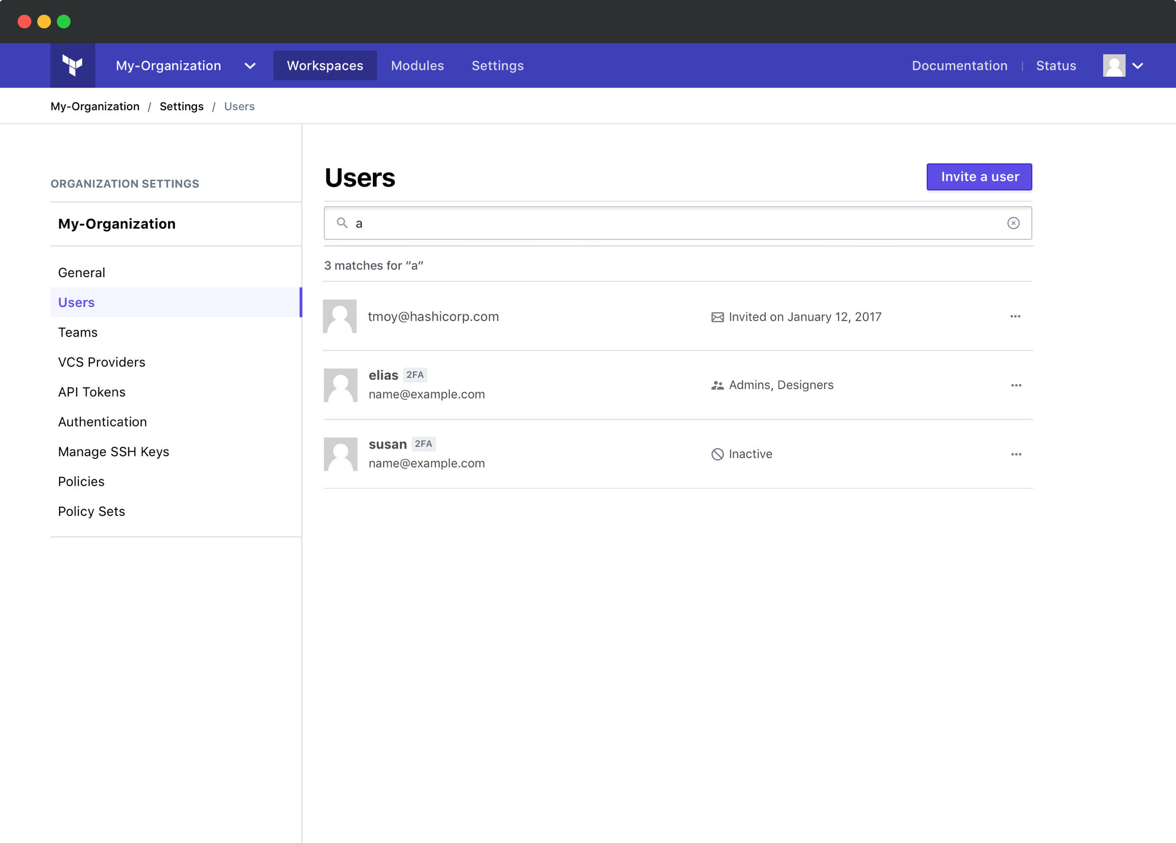
Tabs create a discoverability problem for search. A user might not know a user's status and conducting the same search in each tab creates unnecessary work.
To solve this, when the user conducts a search, it returns results from all users regardless of status. The search box expands over the tabs to reinforce that search is not scoped to a single tab.
Inviting users
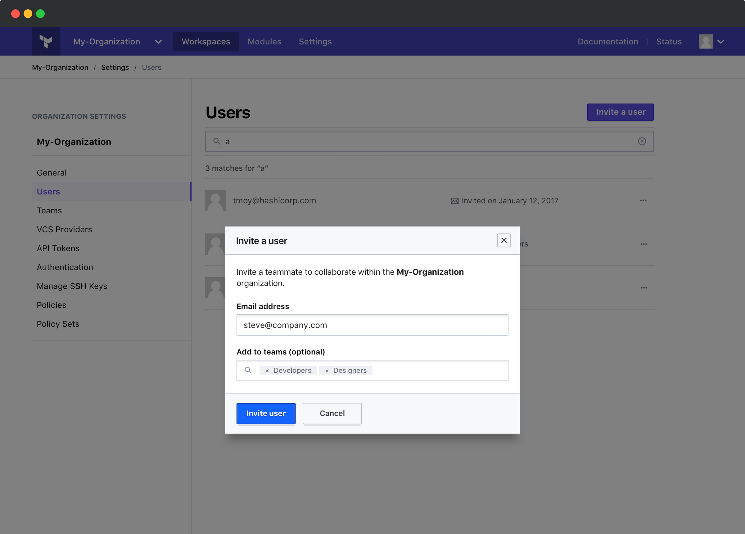
Users can be invited to the organization and simultaneously assigned to teams.
To support these needs, I moved the invite user form into its own modal. This enables it to be quickly summoned from multiple places.
Accepting invitations
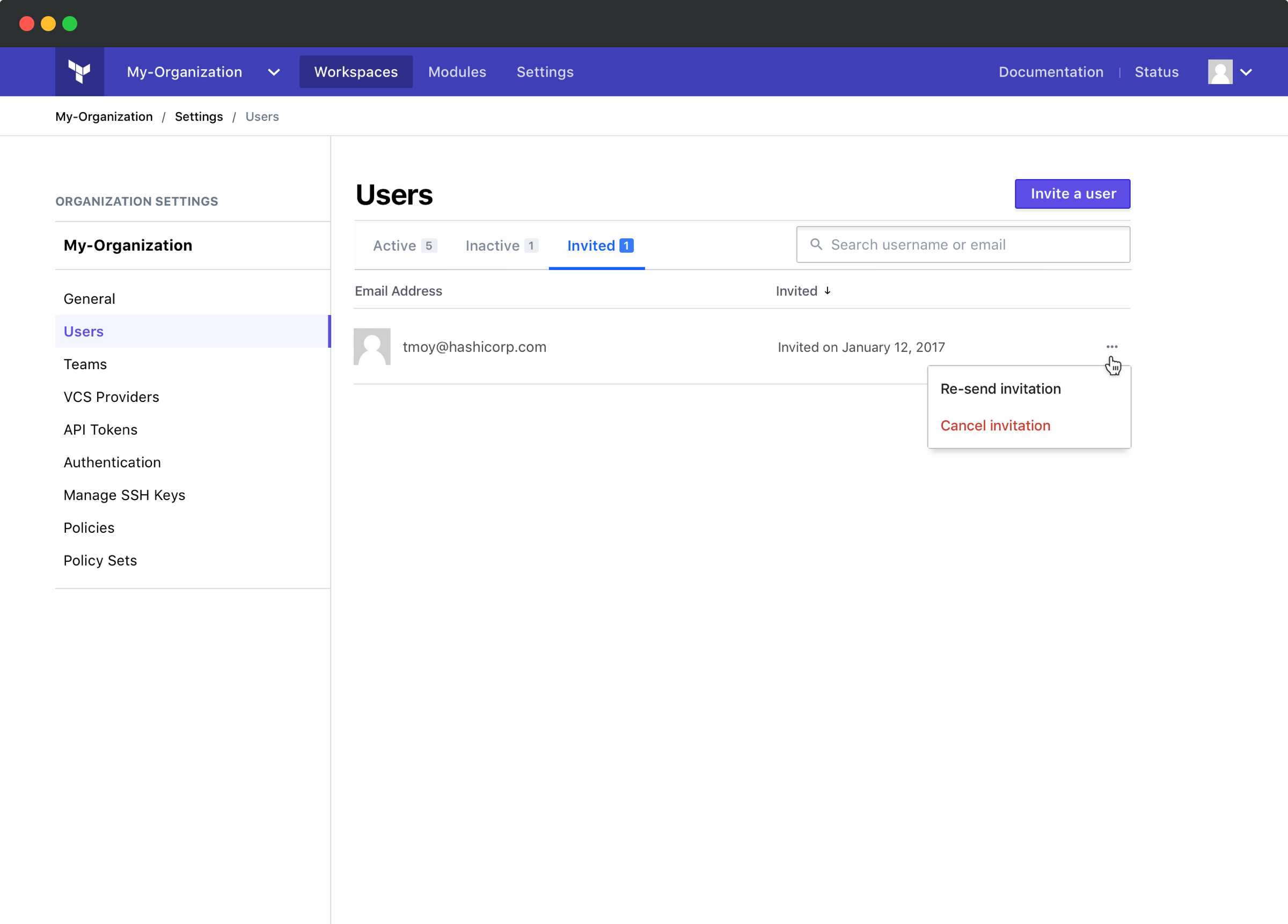
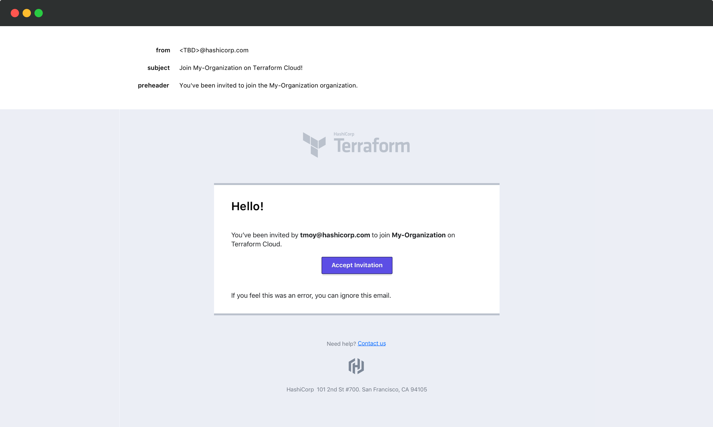
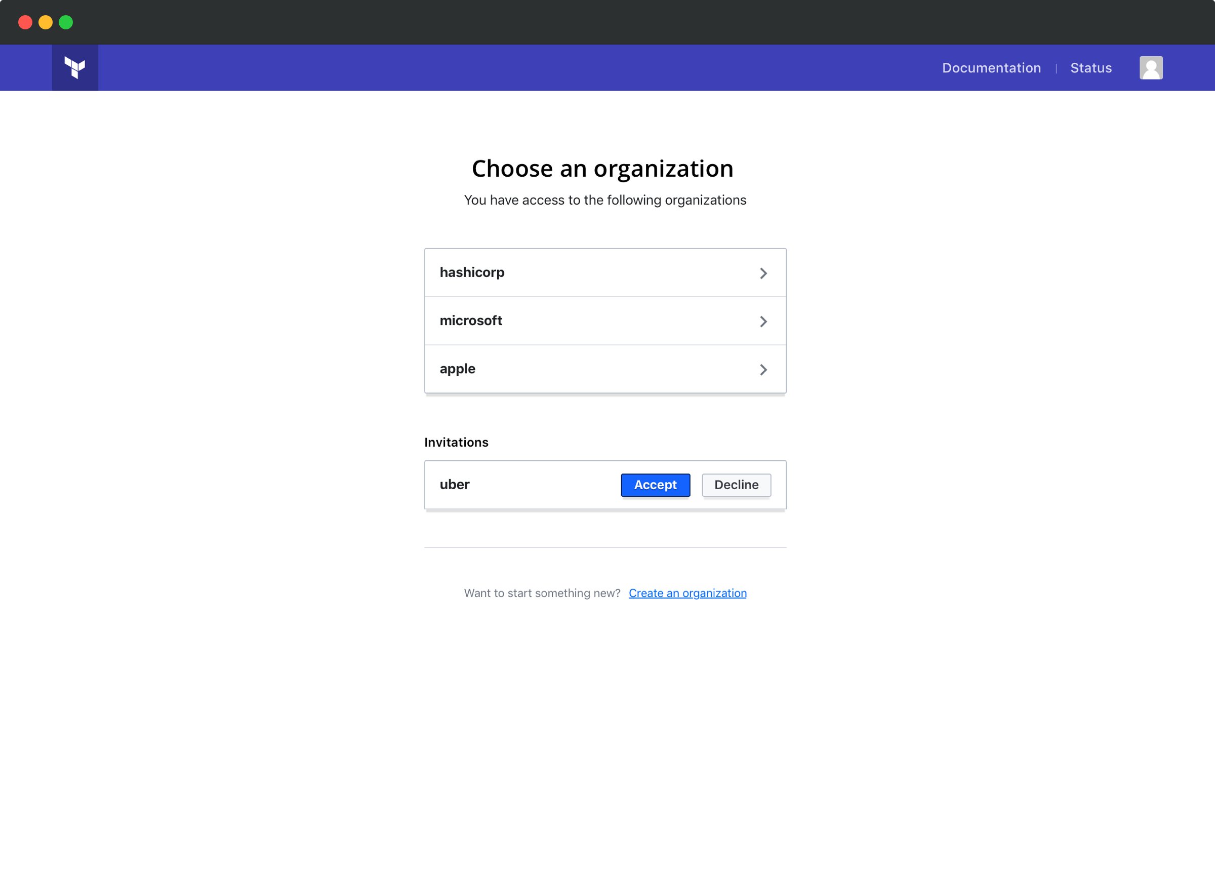
An invited user receives an email with an expiring link. The list of pending invitations is also available inside the app on the organization chooser page.
Handling plan limitations
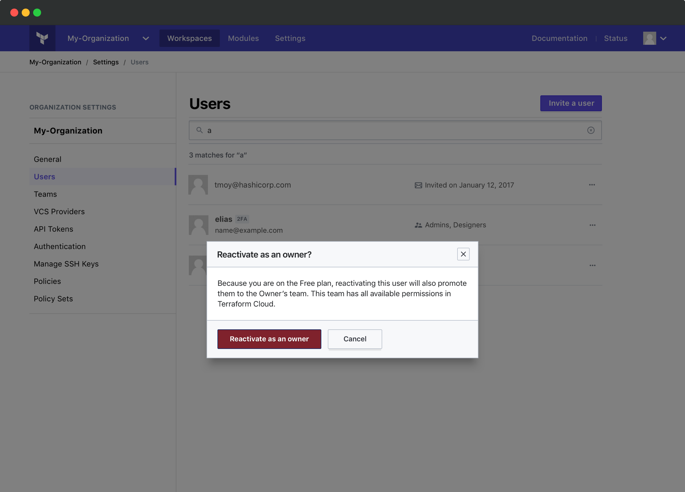
We needed to handle users smoothly upon downgrade. Our free tier allows only 5 users without fine-grained permissions; paid tiers allow unlimited users with access controls.
This presents a problem: how do you treat excess users without full permissions during a downgrade? Escalating their privileges would be an undesirable UX.
When this occurs, non-admin users are placed into an inactive status rather than escalating their privileges to admins. This is a limbo state where we don't let them log in, but we remember their prior privileges in case they choose to upgrade later.
Managing team membership
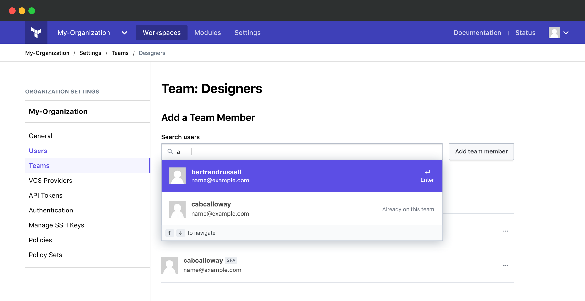
Users may be added to teams using a typeahead. This makes adding users quick and easy.
